Moneysupermarket
A super design system
Design system
Design tokens

The problem
Slow maintenance
of the existing design system
Code and design out-of-sync
no automation
Upcoming brand refresh
site-wide look & feel change
The solution
Identify bottlenecks
within the existing design system
Integration between design and code
to minimise manual updates
Improve design system governance
to reduce design and delivery time
Brand refresh
In September 2021, it was time for a brand refresh for MoneySuperMarket again, transitioning from its ‘Money Calm’ campaign to a brand new one.

MoneySuperSeven
A new campaign introduced a team of seven specialists, each representing a price-comparison area, also featuring Judi Dench in a role similar to ‘M’ from the James Bond films.
The campaign received positive attention for its creative approach and clear messaging, effectively communicating the brand’s expanded focus and dedication to customer savings.
It also made a shift from the old look and feel of the website. The new colours, characters, and tone of voice had to be reflected in the website’s content. Components and journeys had to be updated to be consistent.

Challenges with the design system
Moneysupermarket already had an existing design system. However, even before the new campaign, it proved to be challenging to keep it up-to-date. Updates were implemented manually. It had an ever-increasing backlog. The CMS slowly became unsustainable, and changes were lagging behind. With the new campaign coming up, there was a serious risk that it would make things even worse. Immediate priorities were clear: doing the actual work first, designing, validating, and implementing the new branding on the journeys and the main landing pages.
Updating the design system and documentation didn’t get enough resources. It fell behind compared to the live site. Our design system lost its primary purpose – being the one source of truth.

After the successful launch of the MoneySuperSeven campaign, I led a rethinking of the strategy of the design system. Teaming up with brand/creative, product, and development, we needed to find a new way to evaluate it and fix its main pain points – we needed to treat it as a product.
After a comprehensive audit, we identified what's already working well, and what are the areas for improvement.
The good part
Atomic design system
There was already a solid foundation established, a well-structured atomic design system. A rich component library – designed and maintained in Figma – featuring foundations, components, patterns, and page designs.
The bad part
Lack of automation
On the flip-side, the CMS required a lot of effort to update, and lacked automation. It was a joint effort from the entire design team to set up the first version of the design system, but unfortunately, maintenance still demanded a lot of resources – both its CMS system and its content.
The need for manual maintenance and the limited integration with other tools (Figma, Storybook) found out to be the main reason for its rapid obsolescence.
The team agreed that re-platforming the design system CMS into an established platform with automated features would solve our biggest issues.
The Solution
Zeroheight CMS
After considering many options and the available tools on the market, my team decided to explore 3rd party tool called Zeroheight. I’ve led the partnership and after a successful trial period, we started to connect our component library and codebase into Zeroheight.
Automation
UX and product designers no longer needed to manually update design system content; they became users, not a constant maintenance crew
Simplified handovers
Both developers and designers benefited from simplified handover thanks to features like front-end code generation and design tokens
Design tokens
Tokens introduced fully automated changes in the codebase if foundational changes (new colors, typeface, spacing, etc.) were introduced in the future – like another rebranding

The design system was finally found the way back to its original purpose – being the one source of truth for design, content, development, and other stakeholders.
Project summary
Faster feature delivery
Less design debt
The new design system's automated features simplified design system updates and releases. This not only saved time but also streamlined the product workflow. As a result, designers could focus more on designing for the customer’s problem and less on deciding on the right component or pattern. Less time needed to be spent on developer handovers.
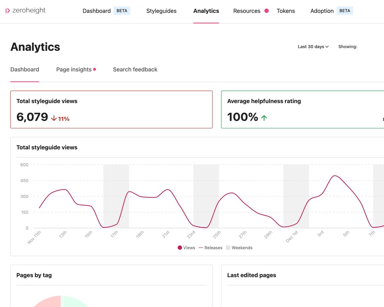
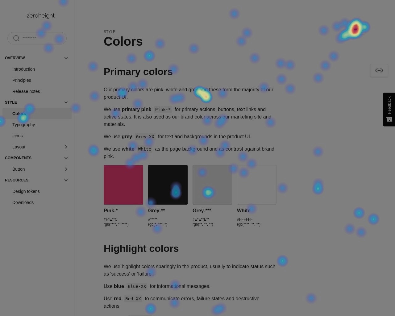
Analytics and heat maps feature provided valuable insights of how the system was being used, tracking engagement and helping the design system team identify popular components and lacking documentations. By monitoring user interactions, it highlighted areas where the system was thriving and where further improvements were needed.
Streamlined component library
Usability blueprints and documentation
Accessibility built-in
The data also revealed opportunities for optimization, such as streamlining components or enhancing documentation. Accessibility gained greater attention, enabling improvements in this area to deliver more accessible and inclusive experiences. The design system – once again – became an essential resource for the business and the product teams.